reMarkable Photography System
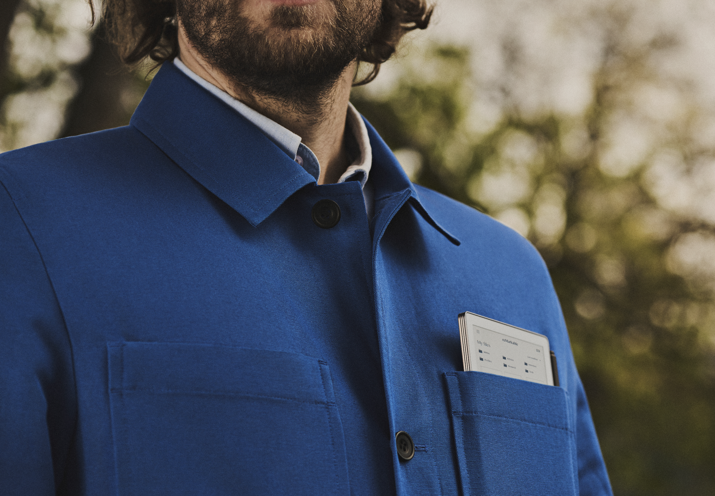
TaskUpdate reMarkable's photography guidelines and develop a new visual framework that reflected the evolving brand while creating greater consistency across campaigns, product launches, and everyday communications.RoleArt director & designerCreative ContributionsDeveloped the "Analog Treatment," a photography framework inspired by the way color images and graphics are rendered on reMarkable Paper Pro. We felt the product's soft, textured color quality shared many of the characteristics of analog photography, leading us to translate that visual language into the brand through long exposures, shallow depth of field, focus shifts, film grain, and a matte finish.The Analog Treatment
To be analog means creating a connection to something tangible—something you can touch and feel.
Paper embodies the way we think, process, and work. reMarkable enhances that experience, and our imagery should reflect the same physical quality.
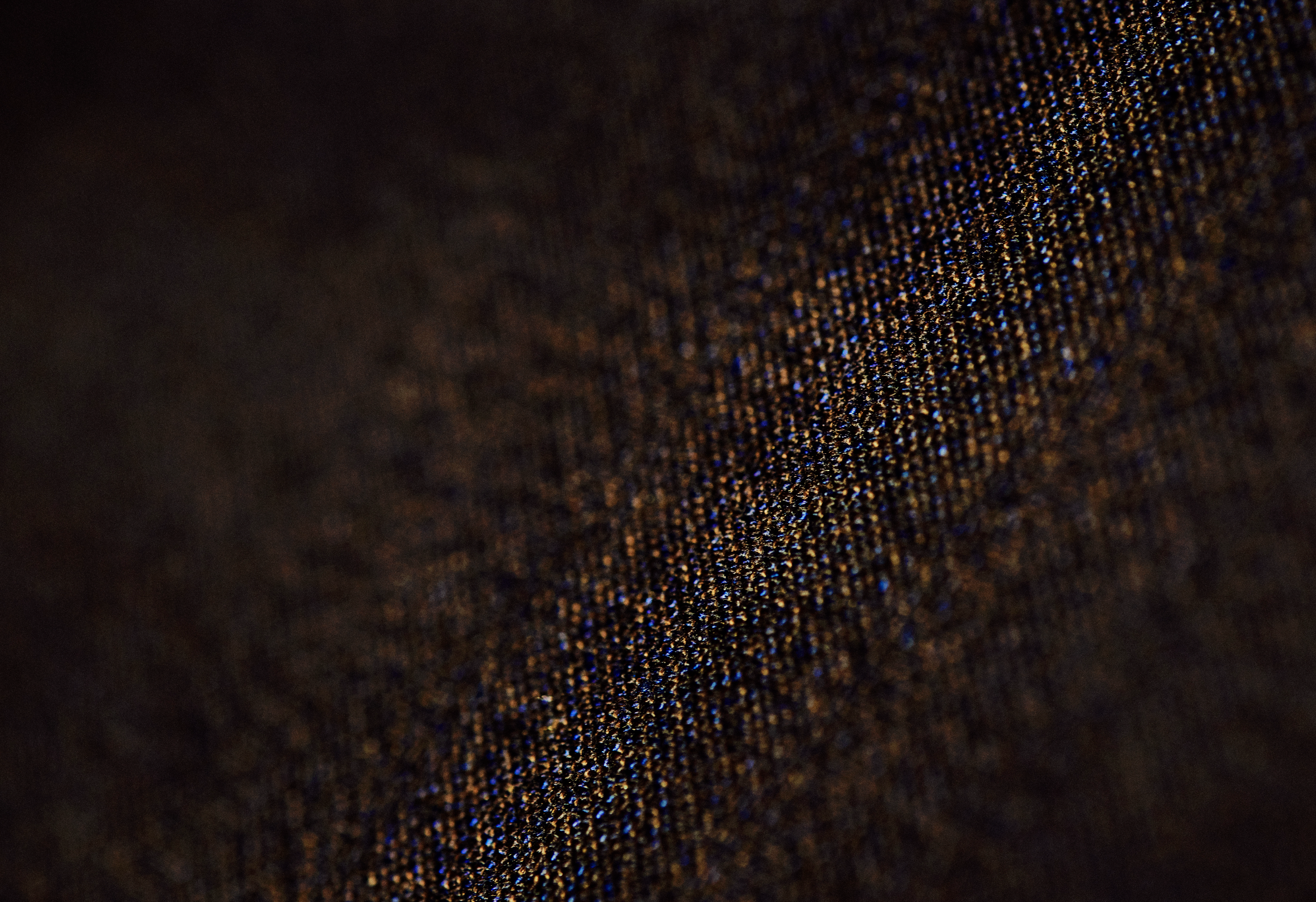
By applying a matte-like finish and paper-like texture, we mimic the look and contrast of a reMarkable display. This links our brand, product, and imagery seamlessly.
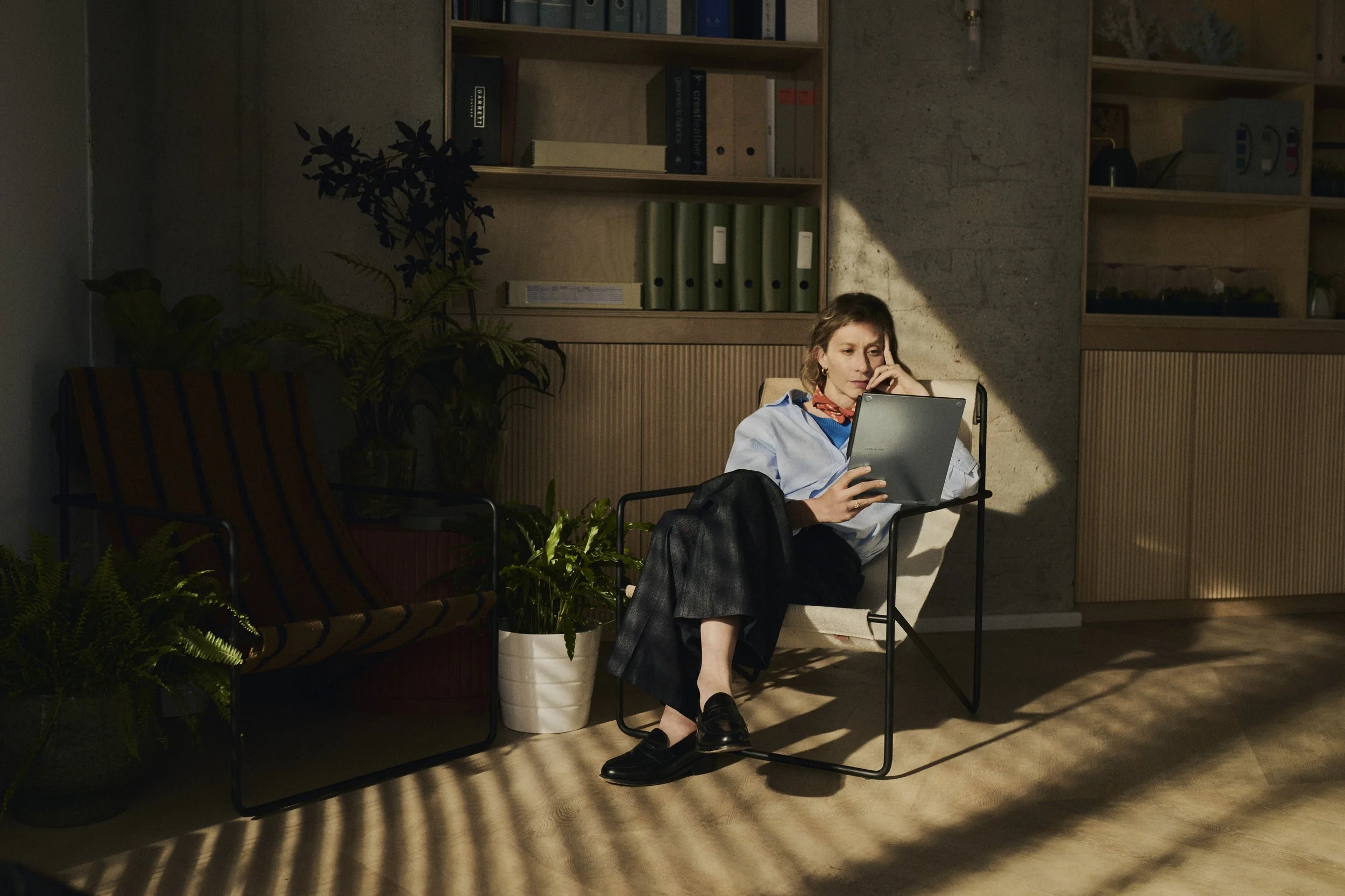
While the final look is achieved in post-processing, for it to fully come to fruition, it depends on the thoughtful application of the entire image guidelines, from lighting and composition to locations, set dressing, people, and styling.
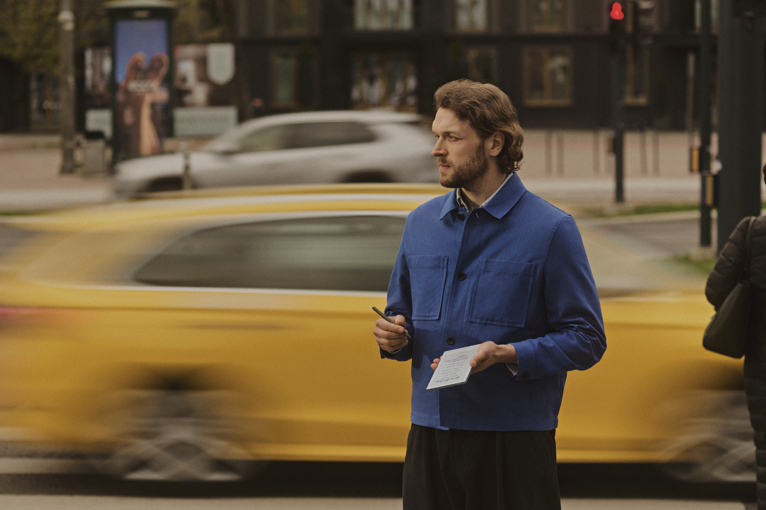
We also use traditional analog photography techniques, long exposure, depth of field, focus shifts, and film grain, to reinforce the feeling of focus and tactility.
The result of the analog treatment applied across our lifestyle, in-use and product photography.